 Named to the 2023 Inc. 5000 list of fastest-growing companies and ranked among the world’s top 100 language service providers by CSA Research
How Translating Colors Across Cultures Can Help You Make a Positive Impact
We know how important it is for marketers to learn all they can about the locales they’re targeting. When considering the visual impact your print or digital materials will have in diverse locales, color is a big component. However, it can be challenging to account for the different ways your marketing efforts may resonate across cultural divides. This article looks at how color is perceived by different cultures, so you can understand the effect your visual choices will have on the people you’re targeting.
Color Across Cultures
Our eyes can perceive up to ten million colors.1 In a brochure, website, or billboard, color directs the eye, evokes emotion, communicates meaning, and ultimately helps establish a company’s identity. As important as color is to cross-cultural communication, there’s no hard-coded formula. Perceptions vary from region to region, and a single color may have different, even contrasting meanings around the world.
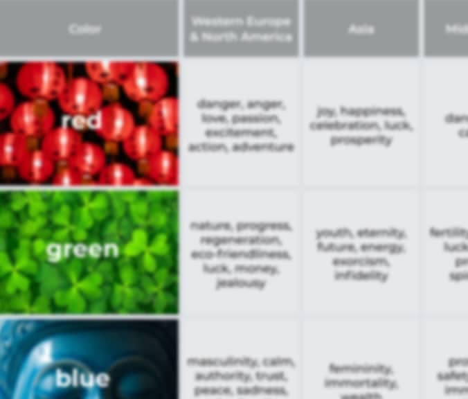
Red
- In Western countries, red evokes excitement, danger, urgency, and love. When red is combined with green, the color scheme becomes festive—the traditional colors of Christmas.
- Red is associated with purity in India (a country where brides traditionally wear red wedding dresses).
- In Latin American countries, red can also have religious connotations when combined with white.
- Red evokes danger and caution in the Middle East.
- In China, red symbolizes luck and happiness (one reason it is used in Chinese restaurants in the U.S.). It is also the color of the Chinese New Year.
- However, in former Eastern European Bloc countries, red can still evoke associations with communism.
Blue
- In Western cultures, blue denotes safety and trust. The color is commonly associated with masculinity and projects authority, loyalty, and security. For this reason, it is used by many banks and has become the standard for police uniforms.
- Blue is one of the most commonly used colors in American marketing, often considered a safe color for a global audience, because it lacks significant negative connotations.
- Blue is tied to immortality, spirituality, and heaven in Eastern cultures. And in Hinduism, the color is associated with Krishna, who embodies love and divine joy.
- With their strong Catholic population, Latin American cultures also associate blue with religion, because blue is the color of the Virgin Mary’s mantle. It can, however, also be associated with mourning.
Green
- In Western countries, green is often related to the environment, progress, and luck. The color is safe and healthy, promoting growth and longevity.
- However, green brings up negative connotations in Indonesia, where it is regarded as a forbidden color, representing exorcism and infidelity.
- In China, green can also indicate infidelity, where the expression “wearing a green hat” means a man is being cheated on by his wife. (No self-respecting man wears a green hat in China.)
- Green is the national color of Mexico, where it stands for independence and patriotism. In South America, however, green is the color of death.
- The color also has strong associations with Islam, and green is currently used in several national flags as a symbol of that religion.
Orange
- Orange represents autumn, warmth, and harvest in Western cultures.
- However, in the Middle East, it is associated with mourning and loss.
- Many Eastern countries link orange to love, happiness, and good health.
- In Indian cultures, orange (specifically the yellow-orange hue) is considered sacred.
- For the Japanese, orange symbolizes love, courage, and happiness.

Yellow
- Yellow is a bright, cheery color associated with happiness, optimism, and warmth in the U.S.
- However, yellow also has an array of negative connotations in other parts of the globe. In Egypt and much of Latin America, the color is linked to death and mourning.
- For Germans, yellow symbolizes envy and jealousy.
- Golden yellow hues are associated with money, status, and material success in many countries.
- In certain African countries, the color is worn only by those who rank highly in society, due to its connection with money and success.
Brown
- In the U.S, brown is an earthy color that is stable and dependable. Food containers are traditionally brown, and the color is used by delivery companies like UPS.
- In the Middle East, brown is also viewed as a comfortable color that is harmonious with the earth.
- However, in some Latin American countries, such as Colombia and Nicaragua, the color can be met with disapproval.
- Eastern countries and India associate brown with mourning.
Black
- Black evokes sophistication, elegance, and power in the U.S., where it is often used by luxury brands.
- In Latin America, the color is linked with masculinity, and black is often worn by men.
- Black is also associated with mourning in many cultures.
White
- White is associated with weddings, purity, and cleanliness in Western society.
- However, the color represents death, mourning, and humility in many Asian cultures.
color across cultures chart
We've created an easy chart to help you understand how colors are perceived in different regions around the world. As an added bonus, learn about Thailand, where each day of the week is assigned a specific color.
Download Now"*" indicates required fields
Using Color to Express Cultural Sensitivity in Branding
One example of a company effectively utilizing color across its global websites is McDonald’s, whose sites are customized to reflect the color preferences of each country. The company’s signature red is used throughout its global sites, but McDonald’s adapts its usage of the color accordingly. For example, in India, where red is a very auspicious, favorable color, their site uses a very saturated red as a background color in comparison to other sites, where it is reduced to an accent color.
Compare, for example, the very different color palettes used for India, Italy, and Sweden among others: McDonald’s Around the World.
Beware the Pitfalls of Color in Multicultural Advertising
An example of a mistake in this area is Euro Disney, which featured the color purple in signage, souvenirs, and marketing materials. Market research later revealed that purple was perceived differently in Europe than the United States. In Catholic Europe, the color symbolized death and the crucifixion. Due to the negative connotations, Disney redesigned its European campaign, significantly reducing the usage of purple in printed materials and throughout the park.2
Authenticity Matters
This is by no means a comprehensive list, and there are many factors that impact the way people will respond to a brand: history, emotions, and beliefs all have a role. But it’s important to do your best to understand. People everywhere respond to unique, relevant, and targeted experiences. By tailoring your content to the preferences of your audiences, you can avoid misunderstandings and establish authentic, genuine connections.